| Previous | ToC | Next | Labs: Graph Theory. Part 1. | Math Alive |
Networks
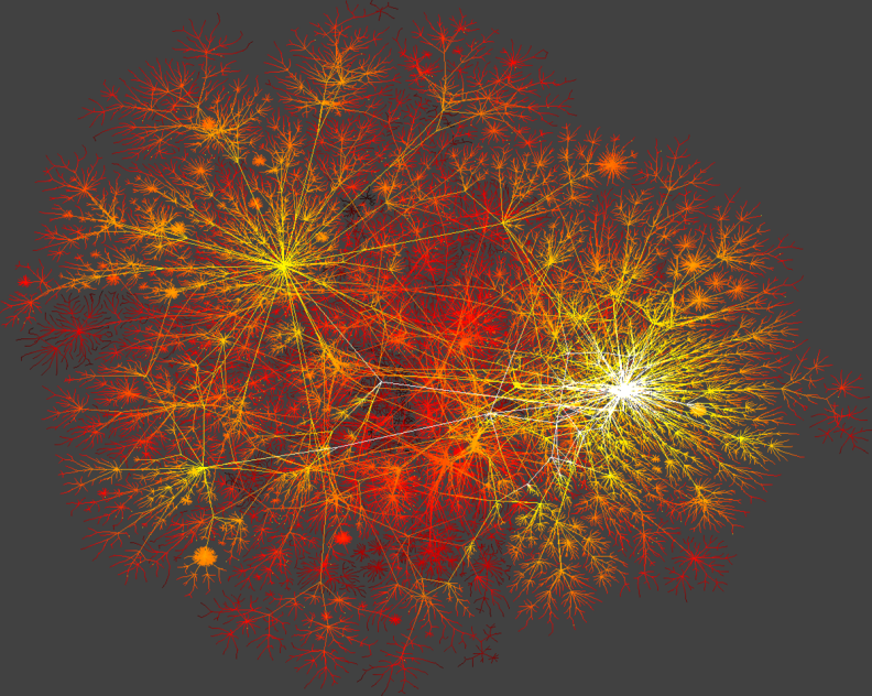
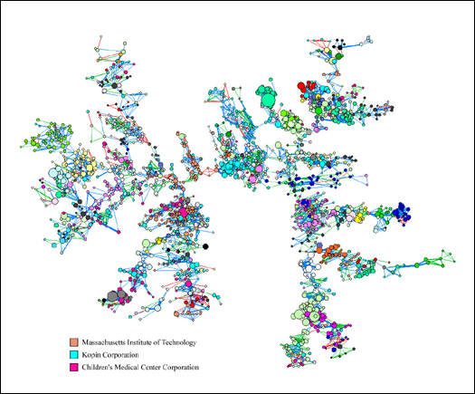
You can find some amazing pictures of Networks at the CCNR website. The pictures are two examples taken from that gallery.
The first picture represents Skitter data depicting a macroscopic snapshot of Internet connectivity, with selected backbone ISPs (Internet Service Provider) colored separately. By K. C. Claffy (www.caida.org)
The Next picture represents the Boston Inventor Networks in the mid-1990s. This graph illustrates the largest connected component of patented Boston inventors in the mid-1990s. Each of the nodes stands for an inventor, with the node's color corresponding to the inventor's organization and its size to the importance of the inventions. Two nodes are connected by an edge if the two inventors were co-authors of some patent. Red edges marke the oldest such co-authored patents, blue edges are less old, and green edges are the most recent. This graph is produced by Lee Fleming (HBS).
| Previous | ToC | Next | Last Modified: August 2008 |